Exhibition | Living Color
August 20-September 12, 2020
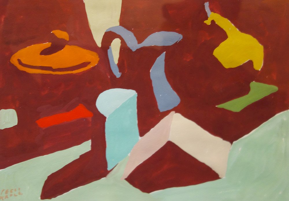
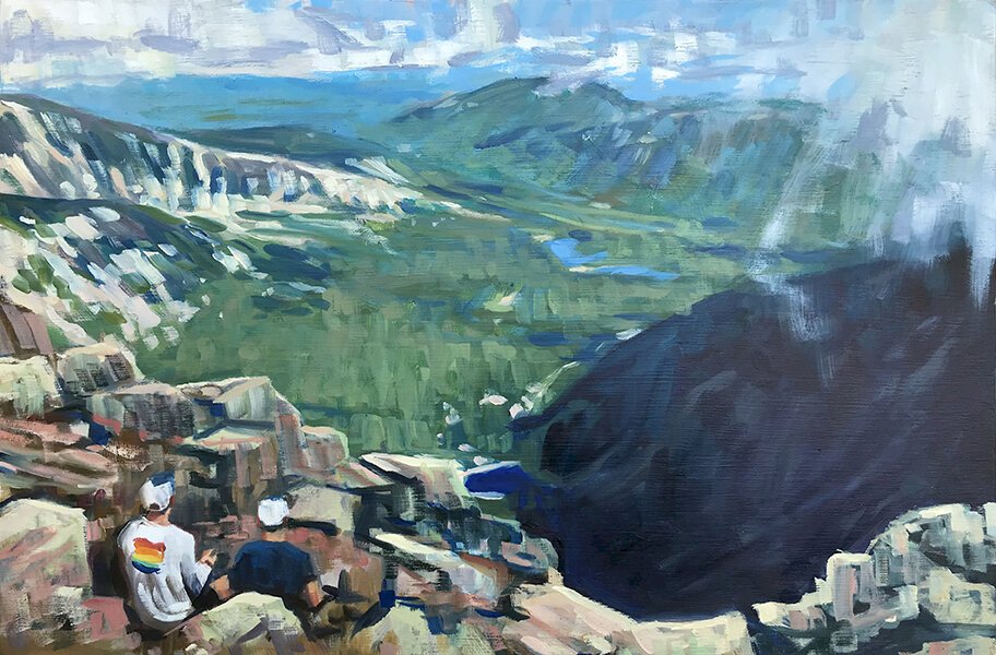
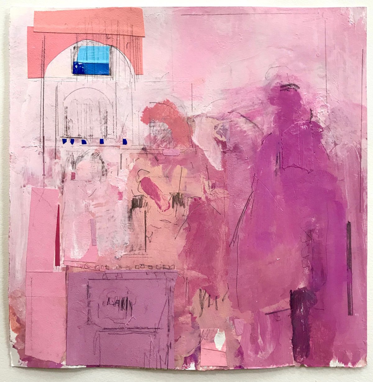
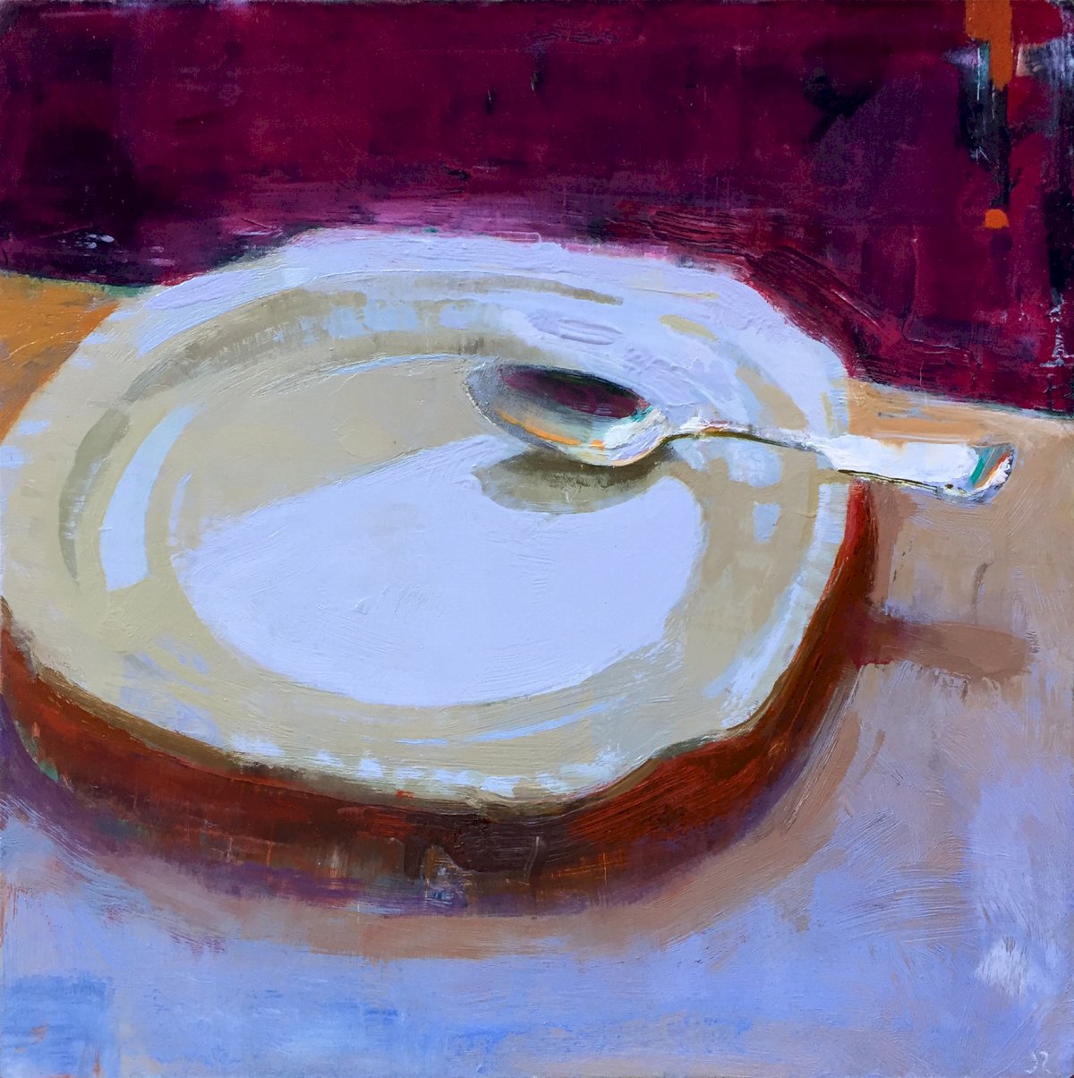
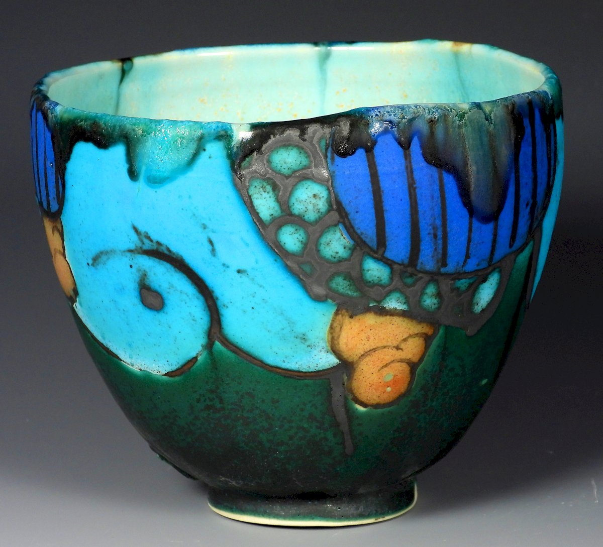
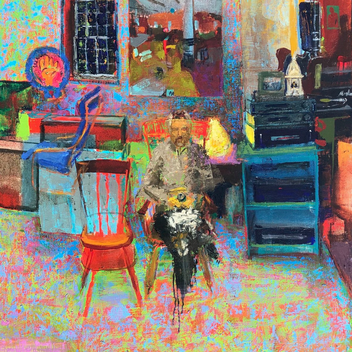
Color can set a mood, cause a vibration, create an illusion, or direct the eye. This show is about the power of color.
Artists include Gideon Bok, Jessica Lee Ives, David Jacobson, Peggi Kroll Roberts, Nathaniel Meyer, Colin Page, George Pearlman, Jon Redmond, Tara Rice, Stuart Shils, Simon van der Ven.
EMOTIVE COLOR
"Color, like a hormone, acts across, embarrasses, seduces. It stimulates the juicy interval in which emotion and sentiment twist." - Lisa Robertson
Color is a direct connection to the viewer's emotions. In the same way that the key of a musical composition can describe a feeling, the color key of a painting sets the tone. Groups of colors can feel uplifting, morose, angry, or bright and happy. Color relationships can feel sour, reassuring, peaceful, or electric.
COLORS IN CONVERSATION
"I found I could say things with color and shapes that I couldn't way any other way... things I had no words for." - Georgia O'Keeffe
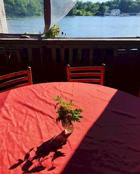
Sometimes a strong color will repeat in an image, such that two color notes force the viewer to notice how they speak to each other. We are being asked to notice those two colors and how they relate across the picture plane. Color is used as a tool to direct the eye, tie the composition together, and create excitement.
COLOR VIBRATIONS
"If you can allow colour to breathe, to occupy its own space, to play its own game in its unstable way, it's wanton behaviour, so to speak. It is promiscuous like nothing.” -Bridget Riley
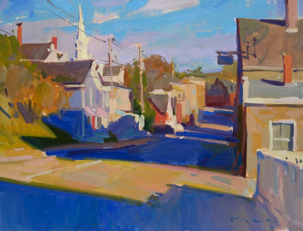
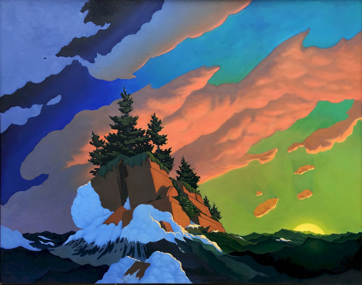
Two colors from opposite sides of the color wheel create a vibration when they are placed next to each other. Depending on the intensity of those colors, the vibration can either come across as a quiet hum that adds some pop to an image, or it can read as an unbearable agitation. This tool can be used to describe the energy of the subject, recreate a sense of strong sunlight, or just add a level of movement within the canvas which the viewer can’t quite pinpoint.
OPTICAL MIXING
“The whole world, as we experience it visually, comes to us through the mystic realm of color.” - Hans Hofmann
Optical mixing is when small dots of different colors read as one color when seen from a distance. Instead of mixing the paint on the palette, the artist lets the viewer see the colors in separate pieces. The viewer mixes those colors together in their mind. Despite the patchy appearance up close, the painting as a whole will read as smooth, blended color. This is the theory behind the pixelation of everything from newspaper comic strip printing, to digital images, to how the impressionists painted light as it broke up into a variety of colors.
COLOR AS ILLUSION
"Make it so that I could recognize the subject from color alone, for color is also a likeness." - Charles Hawthorne
Colors can create aerial perspective or give the illusion of depth. They can trick us into thinking that a yellowish white is as bright as the glare of afternoon sun on the water. Cool colors and softer pastels can push into the distance. Simple color shapes can describe an intensity of light in a still life.
